Power BI Custom Visual - Timeline Circle
Visualize your events in a timeline view.
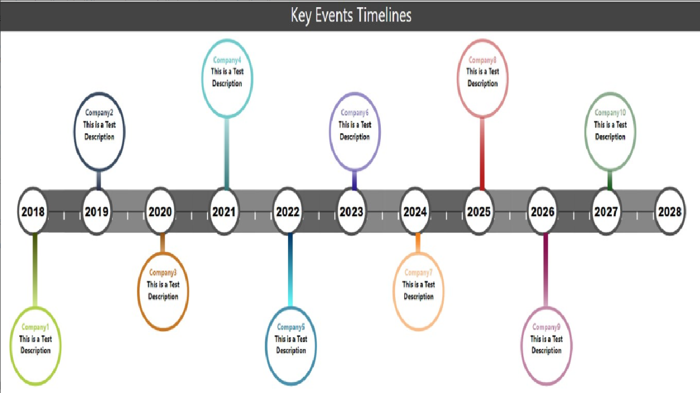
TheraTraQ Timeline Circle is a type of chart which is used to represent a set of key events in a timeline view. The timeline axis shows years and quarters as ticks. It also has dark and light grey backgrounds for alternative year ranges. The key events data are rendered as bubbles with a line that marks the timeline based on the date. If there are two events that are closer to each other, the visualization will create one bubble closer to the timeline axis and one little further so that it can show both data. It also supports multiple day events which are rendered as ellipses with 2 vertical lines. The title and description of the event data will be rendered inside the bubble. It takes a dataset with columns such as Title, Description, EventStartDate, EventEndDate to render the visualization. It picks random colors for events. The Title supports hyperlink.
The customization options are Title, Layout and Circle Background.
Title: The value given in this option will be rendered as a title to the chart.
Layout: TheraTraQ Timeline Circle has a capablity of adding a header image to the top or bottom of the visualization. It takes two values header or footer. If the value is header the image will be added at the top of the chart and for footer it will be added at the bottom of the chart. If no value is provided, the chart will take the entire space for rendering.
Circle Background: This option specifies whether the circle background is opaque or transparent.
Limitation: The chart will show a maximum of 100 events in the UI.
Restriction: The chart will show 1 year prior, current and 8 years in the future by default.
For Support: powerbi-support@theratraq.com